
In most photo lessons, on how to take good pictures of your jewelry, you are almost always told to use a simple, one colour background, in order to not distract the eye from your jewelry. It's not that I disagree with this, but I do think you are in danger of making your web shop look a little bit boring. I always admired the shops, who has busy backgrounds, but still make it work. I've never really figured out how to use props in a good way, though I know some shops do this very successfully. However, I do believe I've figured out some good points on how to use patterned backgrounds. And now I will try to give these points to you :-)

I always use craft paper for my backgrounds. I tend to look for papers which doesn't have any contrasting colours, and where the pattern isn't too obvious. I've often fallen for very advanced papers, which has lots of gorgeous detailing, but the simple patterns does work better. I buy the craft papers at stores that carriages supplies for scrap booking. They often have a huge selection of gorgeous papers. Also always choose papers which has a mat finish. You don't want the paper to shine back at the camera.


I always use natural lighting in my photos. I know you can buy expensive light boxes, but I really don't like the unnatural results they give. I want my pictures to be as true to the real life experience as possible. In the picture above, you can see how I place my piece on top of the craft paper, as close to the window as possible. Really not a very fancy set-up, but I find that it works.

Having a good camera is very important, but always remember to use the macro setting on your camera. Normally it's pictured as a flower. This will set the focus on detailing, and that is just what where looking for, when taking photos of jewelry.
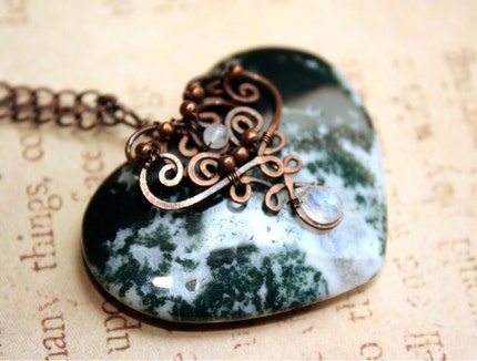 |
| The picture I choose for the web shop - a good all year around background |
Next step is to choose the right background for the right piece of jewelry. I try to consider what I want my message to be. Is the piece a seasonal piece? Do I have a certain story I want the piece to express? Do I want to put emphasize on the colour of the piece? Or do I want to tone down the colour of piece?
My inspiration behind the green heart above was this: New fallen snow on moss, glitters with the sparkles of fairy dust. Small snow flakes are encapsulated to this beautiful moss agate, and lets you feel the fresh air, when the first snow has fallen, all year round.
Now this piece really calls out for being seasonal - more particularly a Christmas piece. But I made the piece in July, not the right season for marketing a Christmas piece. Here's different ideas for using the background of the picture, to change the season of the piece.
 |
| Autumn focusing on the brown colours. |
For autumn I could use this brown background with leaves. This put emphasize on the brown colour of the metal, and makes you think of fallen leaves.
 |
| Spring/summer emphasize on romance |
For spring or summer I would probably choose a light and romantic background. Preferably one that put emphasizes on the heart shape and romantic swirls decorating the pendant.
 |
| Christmas seasonal background |
And to really make the piece stand out as a Christmas seasonal piece, I would choose a Christmas background like this one. If you want to use a background with clear patterns, choose one where the pattern is big, then it wont be as busy.
 |
| Emphasize on colour |
To put emphasize on colour, I would choose a background with the same colour that I want to emphasize. This will make the heart look more green, then it really is.
And to do the final touch it's not enough to just post your pictures as they came out to be. All photos no matter how good, should undergo a little photo editing, to make it look more professional. I want go into all the details on how to use photo editing here, but just show you a before and after picture.
 |
| Before photo editing |
 |
| After photo editing |
Awesome tips - thanks Camilla
SvarSletThank you both of you :-)
SvarSletGreat tips, thank you Camilla!
SvarSletGreat tips, Camilla! I've been thinking of patterned paper for my photographs for a while now... sometimes I use parchment paper, which is just a step up from white I believe. I used that same exact fairy paper in a "treasure box" I made for my niece a couple years ago. It's such beautiful paper.
SvarSlet